Who
Barakat is a leading provider of fresh juices and smoothies, renowned for their commitment to quality and natural goodness. The company's products include freshly squeezed juices, cut fruits and vegetables, salads, ice cream and ice pops, and a variety of hot kitchen items, with no additives or preservatives, enabling hotels, airlines, restaurants, and retail businesses to avail a selection of fresh, appetizing juices, smoothies, fruits and vegetables.
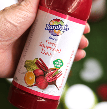
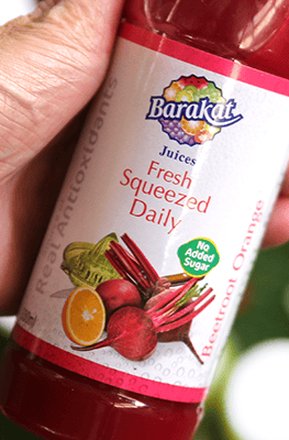
Despite the brand’s strong reputation of over 50 years in the UAE, Barakat’s previous packaging design didn’t reflect the freshness and vitality of its products and felt a bit dated. The issues included:
Overly complex design elements
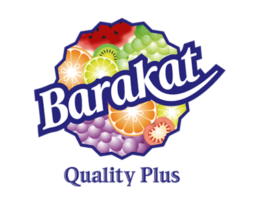
The logo has an image of fruits and vegetables on the background of the brand name that doesn't seem to translate into smaller packaging and screens
Too much information distracts the consumer from what is important
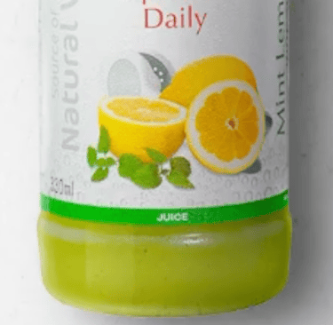
Skewed and pixelated textures as the label background disrupted visual harmony
Distracting graphics that diluted brand recognition
Too many fonts that make the label look cluttered
The brand wasn't standing out on the shelf with its competitors.
Unappealing to new generation consumers
Challenge
Solution
To address Barakat’s packaging challenges and ensure a cohesive, visually appealing, and brand-aligned identity, we implemented a strategic redesign focusing on clarity, simplicity, and impact.
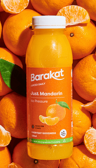
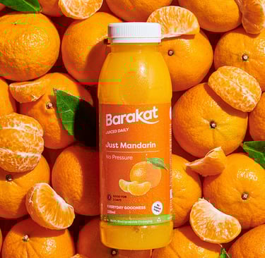
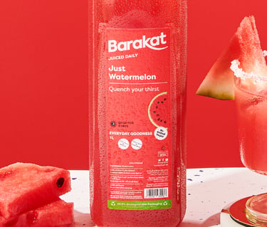
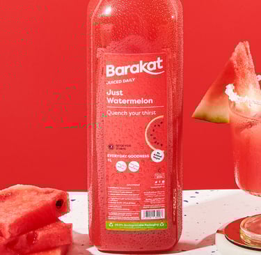
1. Streamlined Visual Identity for Better Recognition
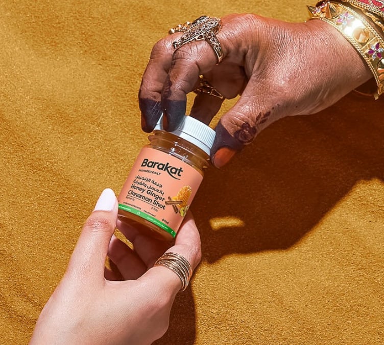
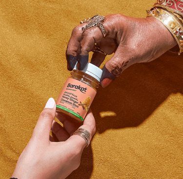
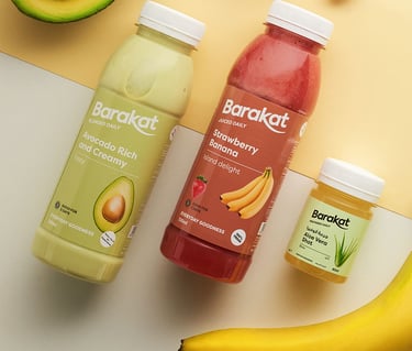
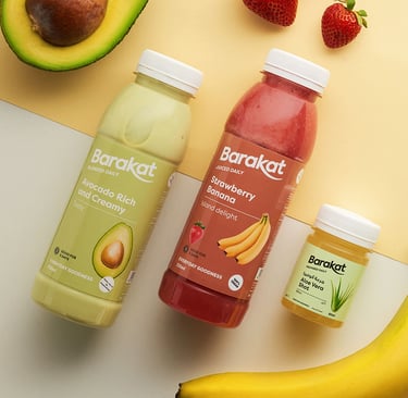
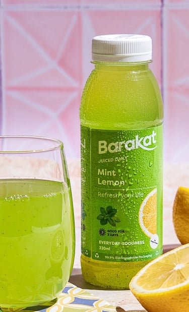
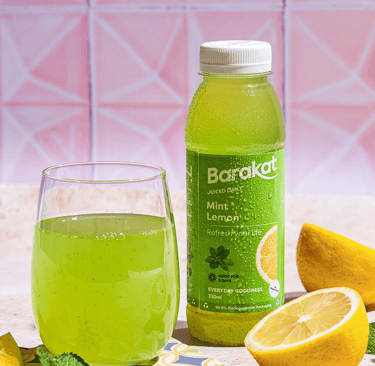
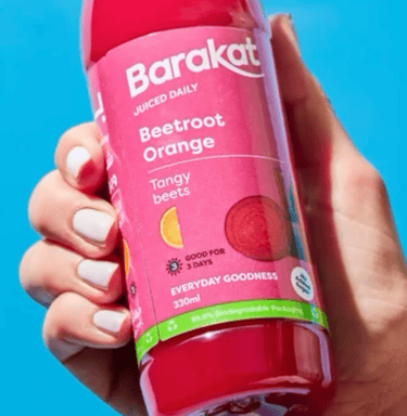
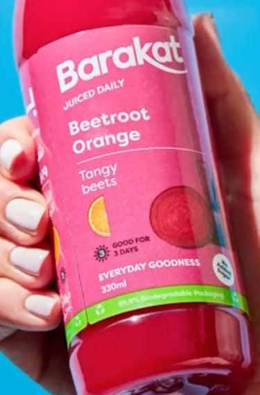
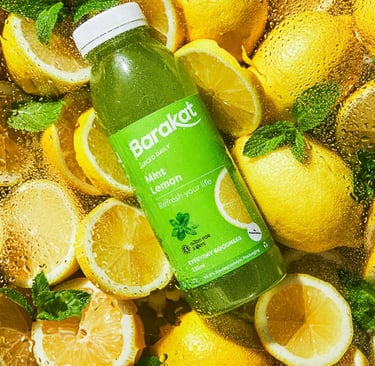
Simplified Logo Design – Removed the background imagery of fruits and vegetables to enhance scalability across different packaging sizes and digital screens.
Using a sans serif font helped to improve readability on smaller sizes as well as gave a fresh and modern look to the brand.
Consistent Brand Elements – Focused on a clean, bold typeface that remains legible and impactful at any size.
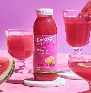
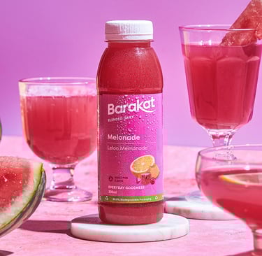
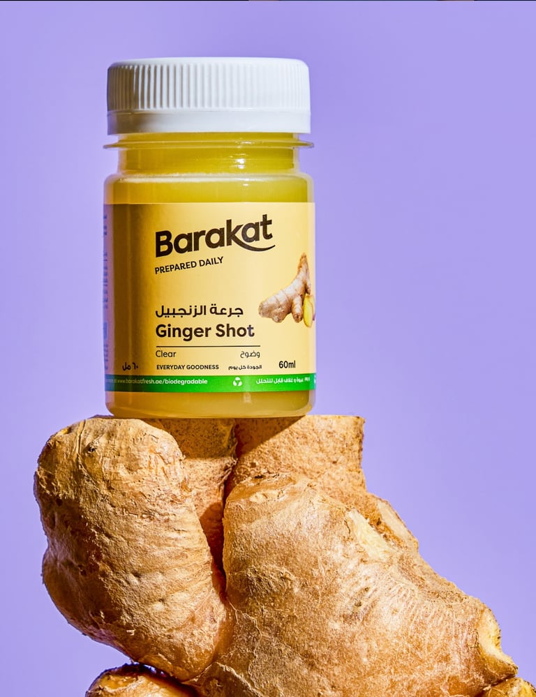
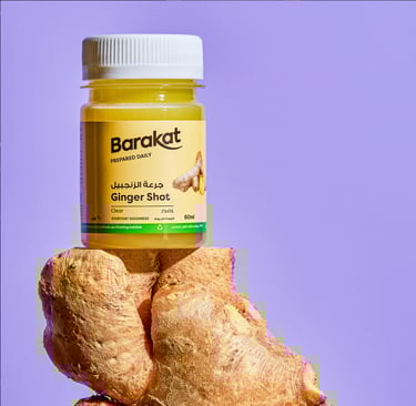
Refined Color Palette – Introduced fresh, vibrant colors that align with the product’s natural ingredients while maintaining brand consistency.

2. Information Hierarchy & Improved Readability
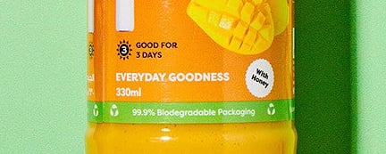
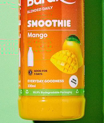
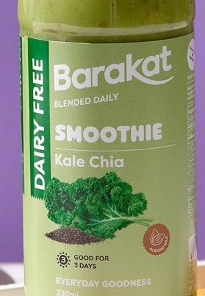
Decluttered Label Design – Reduced excessive text and highlighted key product information, such as flavor and nutritional benefits, making it easier for consumers to make quick purchasing decisions.
Optimized Font Selection – Standardized a limited number of typefaces to maintain a polished and cohesive look, eliminating unnecessary visual clutter. Using different weights of the same font, kept the visual hierarchy while maintaining the cohesive look.
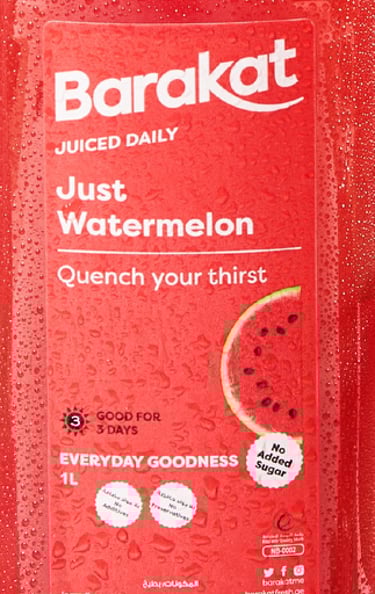

3. Enhanced Background & Texture Quality
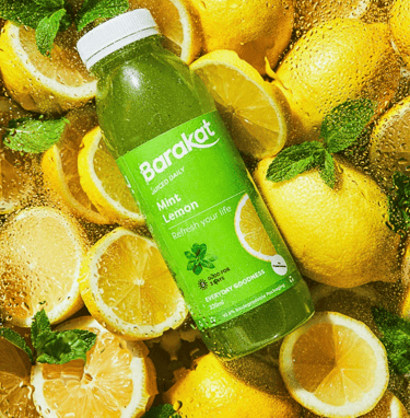
Crisp, High-Resolution Graphics – Eliminated pixelated textures and introduced high-quality images or subtle gradients to create a smooth, premium feel.
Minimalist Backgrounds – Removed overly complex textures that previously disrupted visual harmony, ensuring a sleek, modern aesthetic.

4. Stronger Shelf Presence & Competitive Differentiation
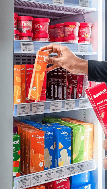
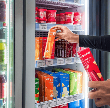
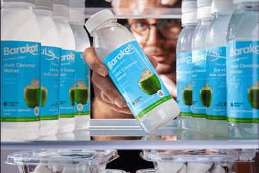
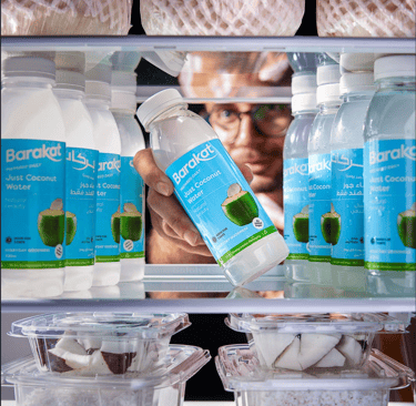
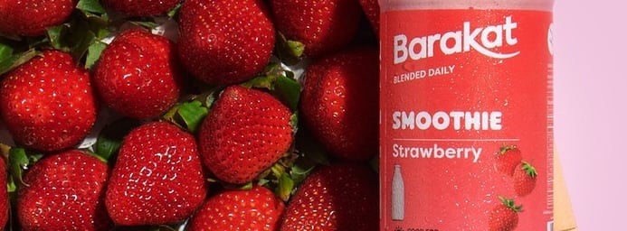
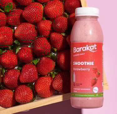
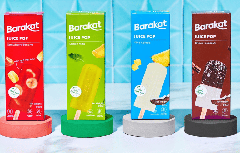
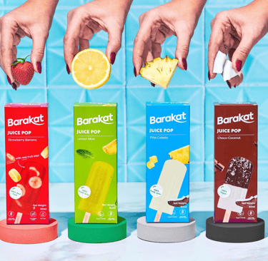
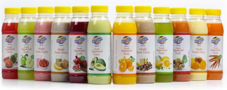
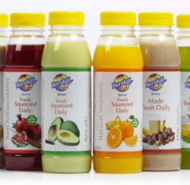
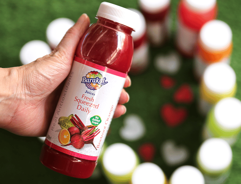
Bold & Distinctive Packaging – Designed packaging that pops on the shelf with clear branding, vibrant yet balanced colors, and an intuitive layout.
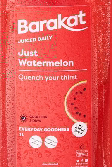
Iconic Visual Markers – Introduced distinctive design elements such as unique color labels to closely match the juice color, custom shapes to identify shelf life and other health factors, and recognizable color coding for quick product identification.
5. Optimized for Digital & Physical Impact
Scalable & Adaptable Design – Ensured the packaging maintained its clarity and effectiveness across all formats, from in-store shelves to e-commerce platforms.
Consistent Branding Across Touchpoints – Created a unified look that translates seamlessly across different customer experiences, whether online or offline.
Outcome
A Packaging Experience That Reflects Freshness & Legacy
Through these targeted design improvements, Barakat’s new packaging now:
Aligns with its 50-year reputation while feeling modern and relevant.
Improves consumer engagement with clear, digestible information.
Strengthens shelf presence by standing out against competitors.
Creates a premium, visually appealing identity that reflects the brand’s natural and high-quality products.